Renderings’ differences based on local marketing approaches

Canada vs Australia vs Europe
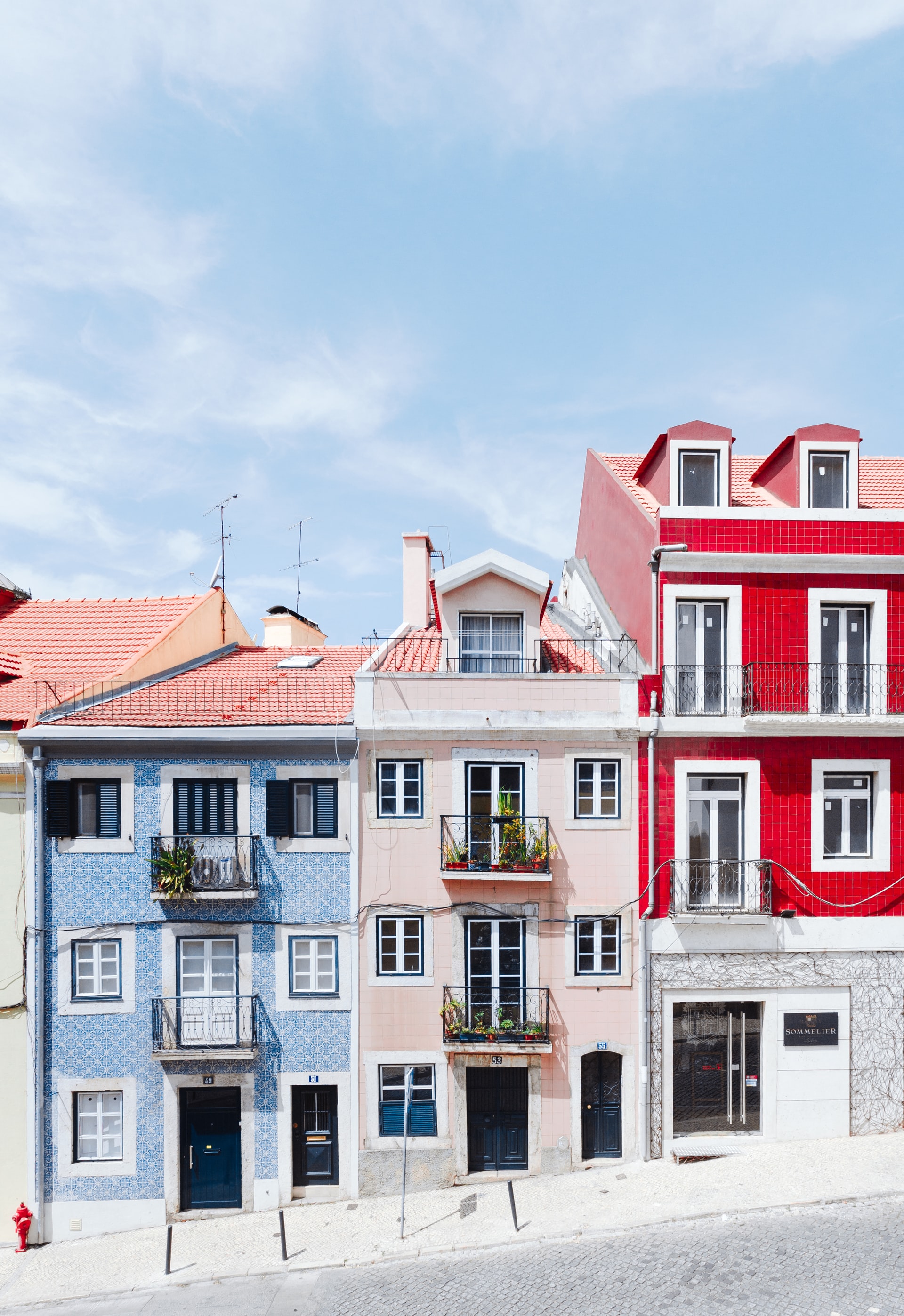
Photo by Hugo Sousa
3D rendering is another type of art in the 21st century. To create beautiful renderings, many 3D visualisers get tons of inspiration from photographs or renderings. “Please check article “Photorealism” for reference”
When you browse renderings, you get an idea of where the rendering has been done. They are common stereotypes per different countries. How can you tell where a certain rendering has been done?
Canada
Dramatic, warm, blue, green, bright and happy
North American marketing renders appear to be demanding more happy colors like blue and green. Preferring Illustrated images over super photorealistic renders.
Expressing photorealism is one of 3D artists’ essential focuses. However, it’s preferred to be refined like illustrated images in North America. It would be interpreted as more illusory in people’s expectation for the new development. Photorealism could be confusing to people, “is this existing building? Or is it an upcoming development?”. An Illustrated image gives a strong idea of a “new development” and it is more clear to the audience.
There are some perceptions why Canadian renderings are mostly bright and colorful.
First, Harsh Weather, a lot of Canadian residents are obsessed with sunny day, warm summers. Most areas in Canada are well known for cold, long winter periods. People seem tired of dealing with heavy snow. Snow starts falling in September in some areas and winter could last up to 6 months. Summer will be a sign of “going out” and “coming back” for the ones who migrate to Florida during winter time. The blue sky and green landscape might be the happiest image for Canadians, it could be reflected in their marketing strategy to give people such a pleasing impression.
Second, Eye Catching, there is no doubt that bright colors stand out more than dull colors. If there is a red chair in an interior scene, it drags your eyes more than a black chair. That is why many designers like using “accent colors” in a scene. This sense could be applied to rendering images too. While beige and Scandinavian tones could blend in with white background page on the website, deep blue or purple will steal your attention first.
Third, Slow Trend, Canada could be one of the most practically grown cultures and society in terms of fashion and art. Unlike some other cultures, people are not too sensitive to trends, more considering reasonable consumption with practical usage. Western Europe like France, Italy, and the UK are popular not only as leaders of fashion design but also have a long history of arts and architecture.
It could be a totally different subject frankly, however, we don’t know if Canadian marketing may also follow European or Australian rendering looks.
Australia
Warm inviting, slightly desaturated, strong highlights, contrasty
A lot of 3D experts follow Australian renders as well as marketing specialists. Just like the local environment, 3D images include warm temperatures with tropical vegetation. Australian renders tend to have a more bright mood, bloom and glareness invites to the space. It could be an illusion seeing or feeling some desaturation in the images because of spreaded bloom and glareness. One thing it defines is not losing the focus in the image even though there is a washed out filter, there is very contrasty manipulation in many results. Strong highlights from the hot weather and dark shadows. The harmony of those contrasting points is well compensated from the disaturated filter.
Europe
Dreamy, photorealistic, moment, moody, heavy, strong depth
Countless historical arts in the mixture of 44 countries attempt varied styles of renderings. It is very hard to define which country has what personality in Europe. 3D artists try a lot of different versions of images. There are things that you can pick up, such as common components though. Images seem to have a strong contrast from the mood. It is not easy to see cloudy or rainy renderings in North American renders, however, you can easily find those heavy moods in European’s. Photorealism could cause confusion. How can it be transformed to non-confusion then? Extreme weather components like snow, rain, stormy weather add computer graphic sense. Also, covering up with some heavy fog in the scene delivers a kind of dreamy fantasy to the artwork.
Another interesting element is you sometimes see live object’s moments in the render. For example, a kid holding a red umbrella looking at the building, a street cleaner working, a person running with a dog etc. You can see the moment of life collaborating into the image, it could be quite eye-catching in general, but that could be another marketing strategy. As long as the live object is guiding to the main focal point (proposed building), it will be a beautiful piece of art.
Some studios focus on an extremely photorealistic architecture magazine vibe. It is close to most 3D artists’ dreams. Furthermore, there is not that much flexibility of choosing art direction for 3D visualiser by standing against the clients, a few rendering studios are generating very solid artwork without artificially added components like rain, fog etc. Very clear, straightforward colors, non-centered composition regarding the property. Overall, renderings in Europe allow more variety.

